Case Study:
The Logo Design Process
A Breakdown for Designer + Client
So what defines a Logo?
A logo is a unique and instantly recognizable identifying mark. Logos are often crafted from a combination of text, symbol, or icon. These elements blend in harmony to represent a brands distinct identity. Effective logos commonly demonstrate 3 key principles – appropriate, simple, and unique. A successful logo should also be memorable, timeless, and aesthetically pleasing. For a deeper look into the psychology behind the logo, see my post about Three Keys to Creating an Effective logo.
When I work with new clients, they often show a keen interest in the creation of this powerful, defining mark that will represent their brand. Unfortunately, they don’t know heads from tails on how to get started, or what to expect. To help guide their creative input I’ve laid out a basic breakdown, which walks through the different phases of research and design. Of course, too much client interaction can stifle a designer’s enthusiasm, and too little may result in an end product that doesn’t quite articulate the true identity of the organization – at least in the mind of the client.
Getting started: Research & Planning
The initial client/designer meet and greet typically sets the tone for the rest of the design process. If working together isn’t a good fit, it’s fairly obvious from the get go. If that’s the case, make some rules upfront on how much interaction you need with the client by outlining your process. It’s important for both parties to set expectations and discuss the details up front. Time and cost are the big ones, so get those out of the way first!
The process doesn’t really get started until both parties have communicated objectives and an agreement is established – time to pull out that contract to ensure everyone’s protected. The client has to be willing to impart a detailed overview of their product, company or service. The designer has to communicate cost and time, and how this corresponds to deliverables. It’s also good to reassure the client that you’ll be providing a finished design that meets the core values of their business.
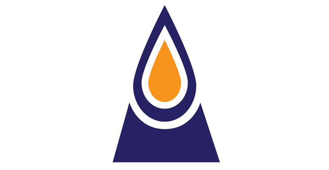
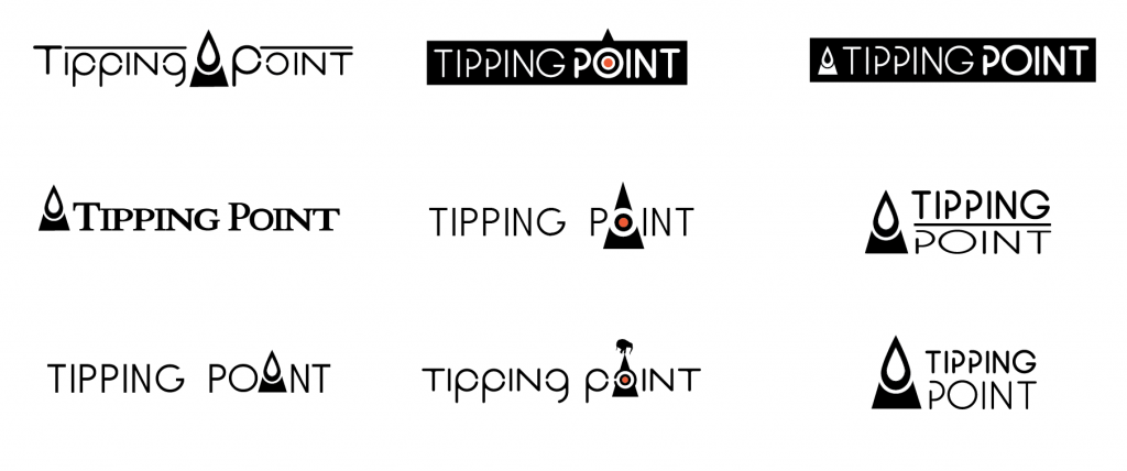
For this exercise I’ll show examples of a logo project from 2010. My client was Tipping Point Networks – a data forensics group located in San Francisco. They commissioned me to create a new identity for print and web. They were interested in participating in the design process, and requested a series of visual explorations based on our initial research session. After a short Q&A exercise we established the key components of the Tipping Point brand: balance, sophistication, progression, and the concept of chain-reactions. Explorations around the business identity placed emphasis on an integral component of a larger mass and the concept of “teetering on the balance”. (An elephant image was highly suggested at one point, however this was abandoned – thankfully).
>> The Tipping Point logo is symbol and text based.
I use the 10-step process outlined below as a road-map to help my clients understand the steps involved. I tweak the outline to accommodate individual specifics depending on client requirements and project scope. (What’s their timeline, how many revisions would thy like to see, etc.)
Step 1: Design Brief
The first step of the design process is the most critical, which means it requires the most input from the client. Before creating any graphic elements you need to possess a thorough understanding of the company, product, or service. The objective of this exercise is to summarize the core values of the business. Begin by defining the company’s overall personality; this includes brand values, competitors, vision, target market, mission, and stylistic attitude.
Working with the client create a list of keywords that define the identity – write down anything that comes to mind (this is referred to as a “brain dump”). After that narrow the focus to emphasize images and symbols that can be used to stylistically define the keywords you came up with from the first exercise. Any existing stylistic elements should be discussed if relevant – such as existing collateral/visuals, primary/secondary color pallets, and typography.
Here’s some general questions you’ll want to ask to kick things off –
- What’s the purpose of the logo, and where will it be used?
- What exactly is the product/service that the business provides?
- What is the company’s history?
- Who’s the target audience?
- Who are the main competitors?
- What medium will the logo be displayed? Print or digital?
- How many revisions/concepts does the client want?
- What formats are required?
- What is the deadline?
Step 2: Concept Sketches
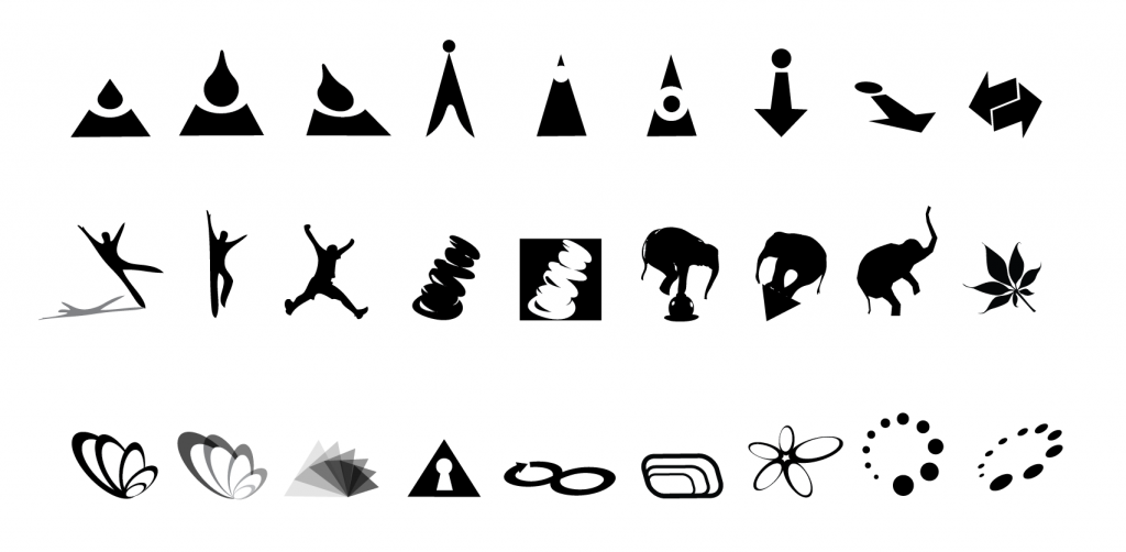
Using the information gathered from the brainstorming session, create concept sketches emphasizing the core values discussed. Sketches primarily include text, symbol, or a combination of both elements depending on the information gathered in Step 1. You can also work digitally at this stage – but I highly recommend starting the old fashioned way as it always saves a ton of time upfront.
>> Focus on symbols and icons – unless the logo will be purely text based. Address text/font variations at Step 5. Start with at least 10 concepts to get things rolling.
Step 3: Review & Feedback – Is the Design On Track?
Design is an iterative process, and every project requires a circular evaluation after each step. Is the design on track? Are we meeting the goals of the client? If things are going sideways it’s better to identify and adjust focus then plow forward in the wrong direction! Focus on those core values established in the research and planning phase. Allow ideas to expand in different directions if not on target. Ideally a few variations can be selected for moving forward in digital format.
>> Select 3 concepts to develop digitally.
Step 4: Digital Prototype – Designing in Black & White
The logo begins to take shape as rough sketches are fine-tuned using design software such as Adobe Illustrator, Photoshop, or Fireworks. It’s best to concentrate on creating in black and white at this early stage. Start thinking about color, but don’t go there yet. Color can complicate the design, drawing the viewer’s focus away from the raw form, which can lead to shortcomings in one of the three key areas. Is it Appropriate, Simple, and Unique?
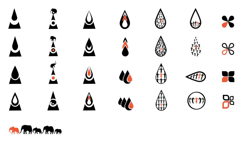
>> Start by selecting around 3 base concepts; develop 5 variations for each of these for a total of 15 samples to review. Narrow these down to a primary and secondary design.
Step 5: Typography – Selecting an Appropriate Font
It’s time to start thinking about text. In the Tipping Point example the client knew they wanted a unique symbol that could stand alone – but they also needed a symbol + text based logo so their target audience would be able to recognize their brand. (It’s not like they’re Nike!) Custom typefaces, or fonts, play a powerful role in alluding to the unique personality, vibe, or culture of a brand. The expressive style of custom fonts can be largely responsible for how the target market identifies with the brand.
>> Using a custom font can add instant personality and really enhance a logo, but be cautious; the wrong font can also ruin an otherwise successful design. This should be intuitive – select carefully with target market in mind and make sure your choice makes sense. Start with around 10 variations.
Step 6: Logo Prototype – A Blend of Font & Symbol
You’ve narrowed it down to several symbols and fonts – try mixing up arrangements, formatting, and font styles.
A great design can be ruined without proper white space – let it breath! Ensure space exists between individual elements and the composition does not feel crowded or tight. Adjust formatting (light, medium, or bold styles and italics), tracking (space between words), kerning (space between characters), and leading (space between lines of text).
>> Without adding color, verify the design is successful in black and white before moving on. Provide 5 combinations.
Step 7: Concept Review & Lock down the details
Once again it’s time to circle back to the criteria established during the initial brainstorming phase. Narrow the options down to 3-4.
>> I always add an option that I know the client doesn’t like – this makes the decision making process easier for everyone involved. 🙂
Step 8: Final Logo
The final black and white design is locked – include both black on white and white on black versions.
Step 9: Color & Polishing
The addition of color should not be an afterthought – it’s a powerful tool in your design quiver. I won’t dig into the psychology behind color in this article, but make sure you apply it thoughtfully and with some research. Color can make or break a design, so make sure it works with your clients identity and complements the overall aesthetic you’ve already established. Also, depending on where the logo is destined you’ll need to make sure you’re not breaking any societal customs or taboo. Additional enhancements such as drop shadows, effects, and stylized features are added if desired.
Step 10: Deliver the final logo design
The complete logo package is delivered to the client. This usually includes the source file formats – vector (scalable) and raster (non-scalable / pixel-based), along with a variety of file types depending on client requirements. This guarantees it is versatile for any medium and dimension – be it web, print, broadcast, billboard, or business card. A final design package may also include requirements for digital use such as an app icon, or for print such as a business card and letterhead.
A standard package for just the logo may include black on white, white on black, color, and enhanced versions. Possible file types can depending on final destination may include PSD (Adobe Photoshop), AI (Adobe Illustrator), JPG, EPS, TIF, PNG, and PDF formats. Additional versions and file formats may be provided upon request.
