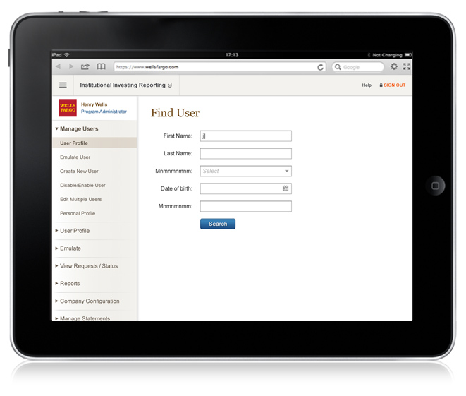
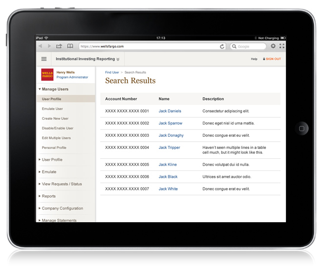
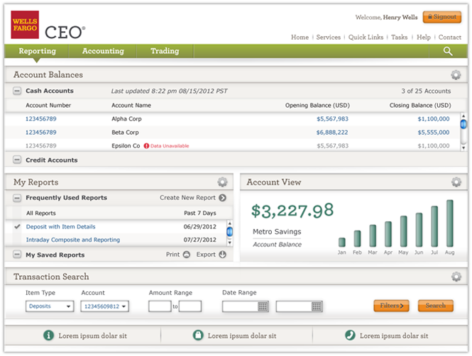
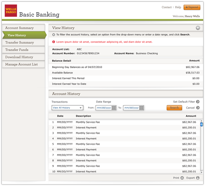
In a channel-wide initiative to refresh the look and feel of the current CEO® Portal site, Wells Fargo partnered with Razorfish to establish clear UX goals and develop a library of UI components that would become the foundation for its touch-optimized future-facing enterprise site. The existing CEO Portal was not optimized for multi-screen and was built on an outdated UX and visual library.

Wells Fargo CEO Responsive UX
Senior Designer - UI, Interaction & Visual Design
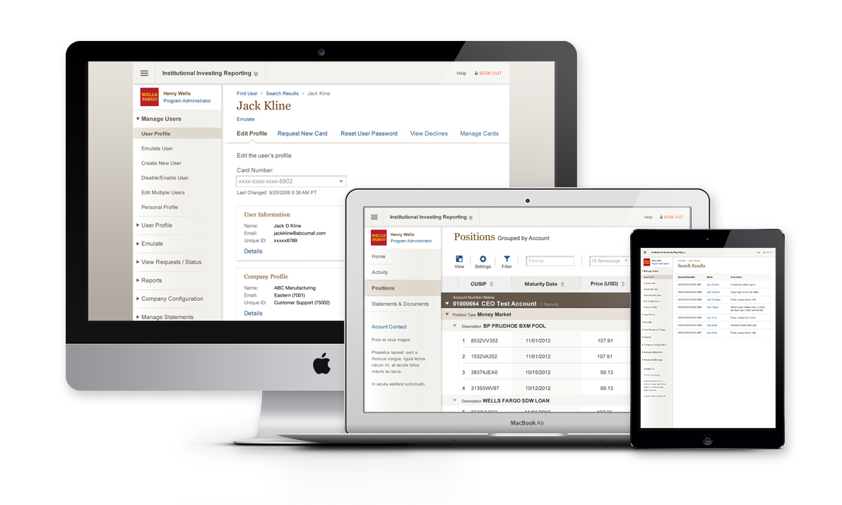
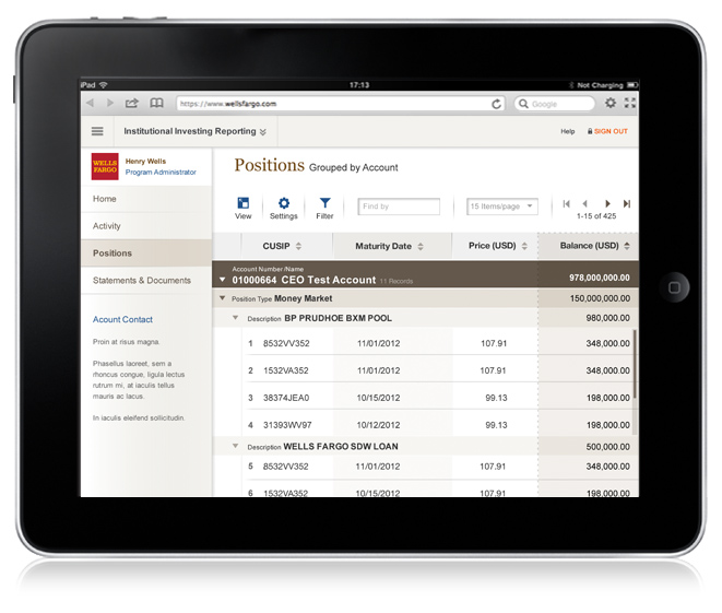
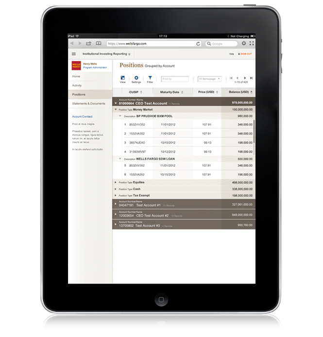
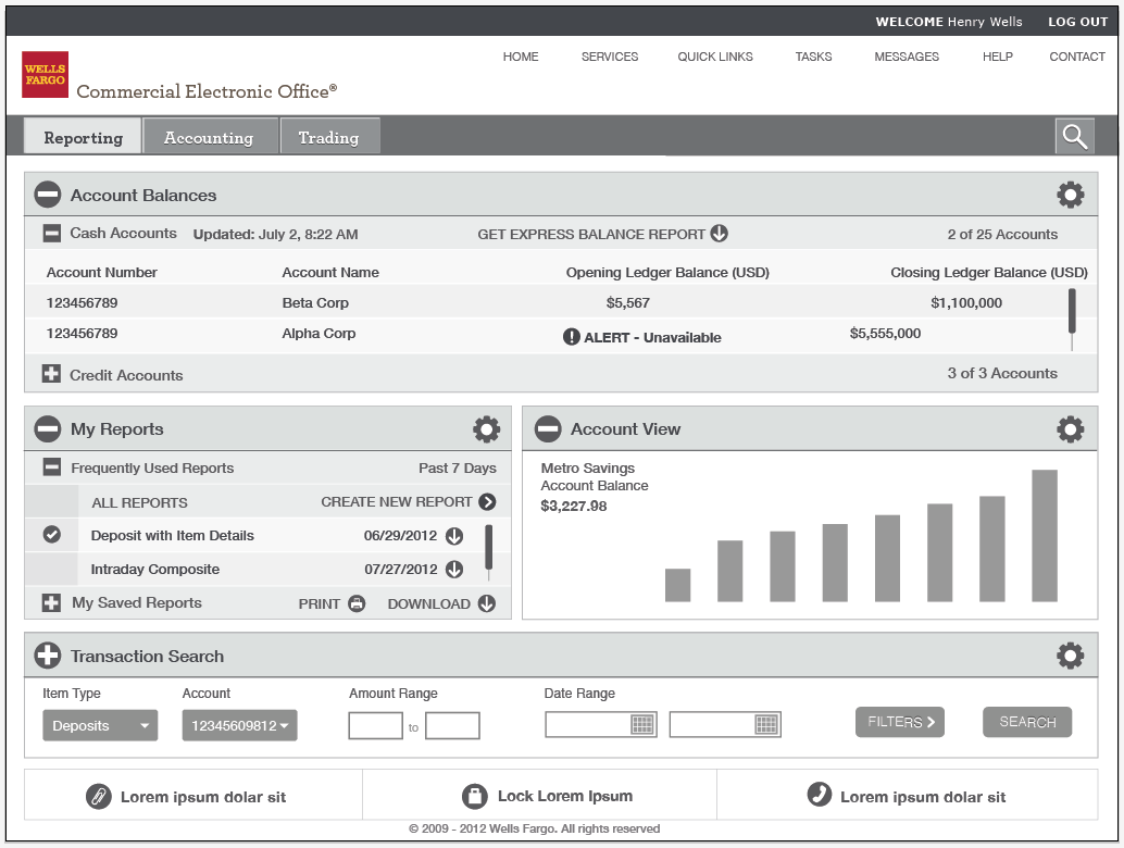
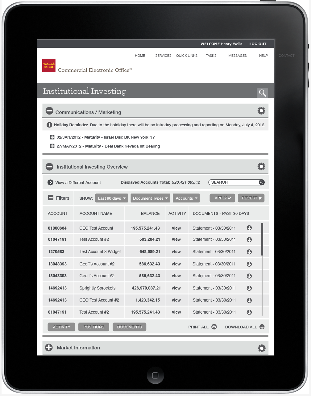
The goal of the redesign was to articulate a modern aesthetic that strongly defined the wholesale brand and showcased a strong distinction between wholesale and retail applications. UI designs were created around future and existing applications which demonstrated complex data tables and customer data sheets.
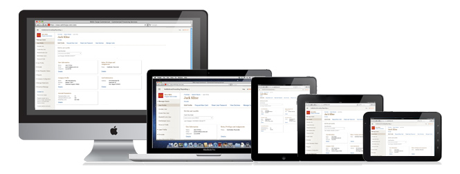
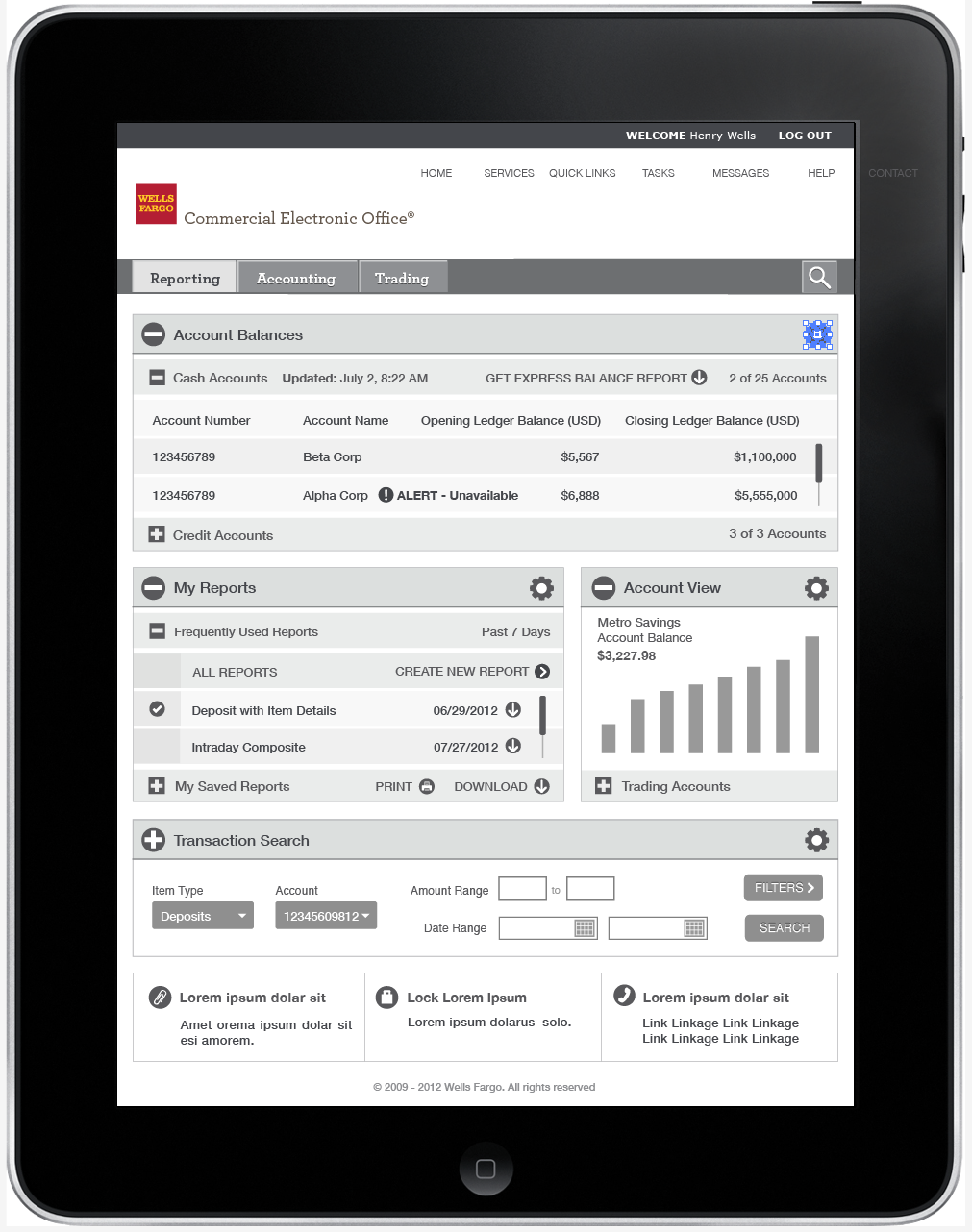
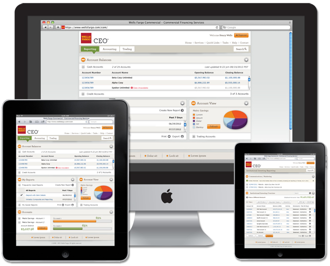
My role in the project was to create a seamless visual skin that was responsive to the screen sizes of various touch devices and desktop resolutions. Collaborating with another senior designer, we led visual and UI design to build a functional prototype, skins, and animation mockups. Throughout the design process we worked closely with Razorfish UX leads, interaction designers, technical leads, and project managers in a highly iterative, Agile environment.
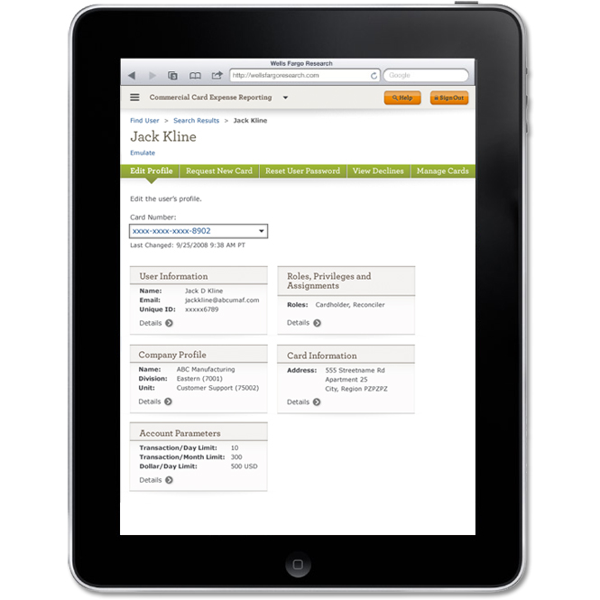
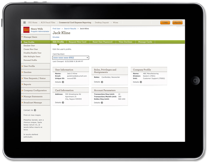
Partnering with UX Research throughout the process, we did usability testing to ensure a customer-centric approach and identify user painpoints and problem areas. Visual design adhered to common guidelines around responsive design best practices and ADA compliancy. Test dimensions were created for the iPad 2, Galaxy Tab 2, and common desktop resolutions. Breakpoints were established to support tablet and desktop resolutions of 600, 768, 1024, and 1280 pixels. Mobile devices were not included in the initial roadmap based on UX research and user models.
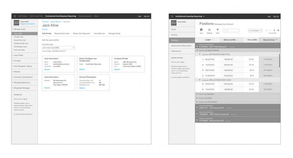
Below:
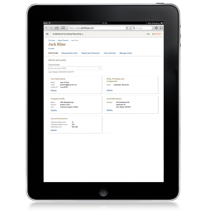
- Wireframes and final hi-fidelity designs – Commercial Card expense Reporting, and Institutional Investing Reporting.
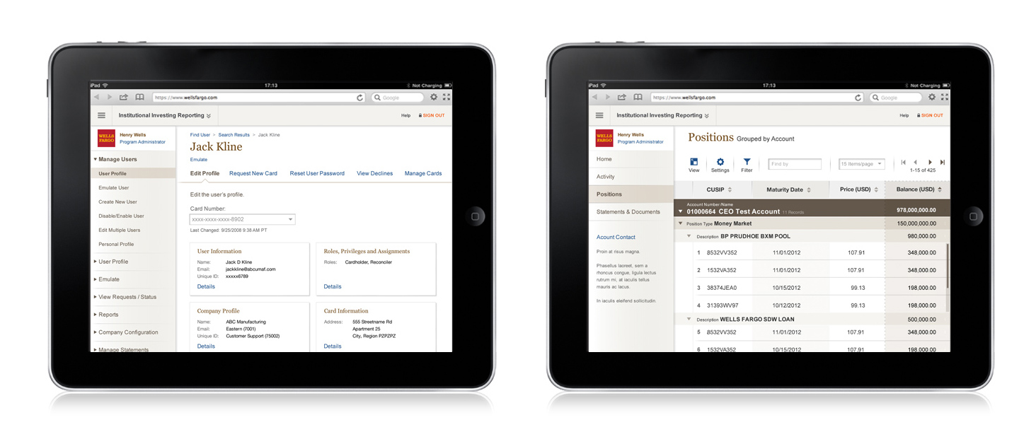
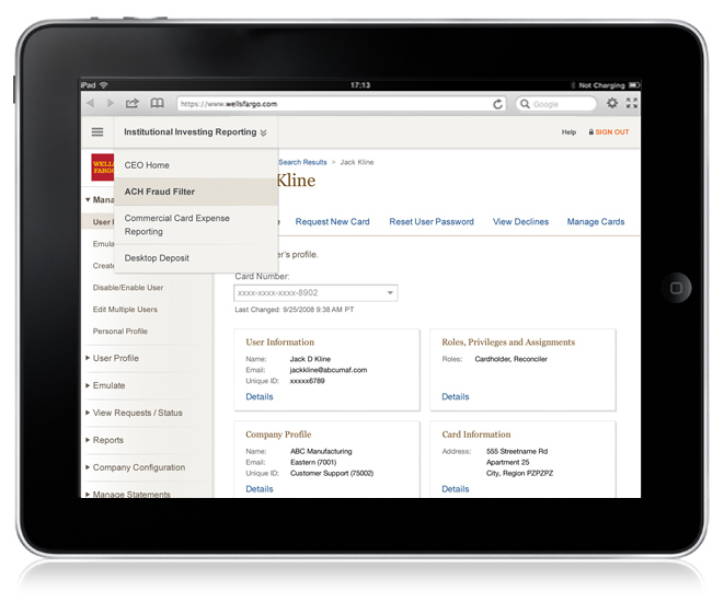
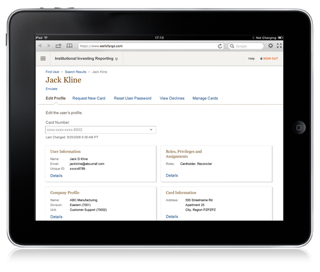
Below:
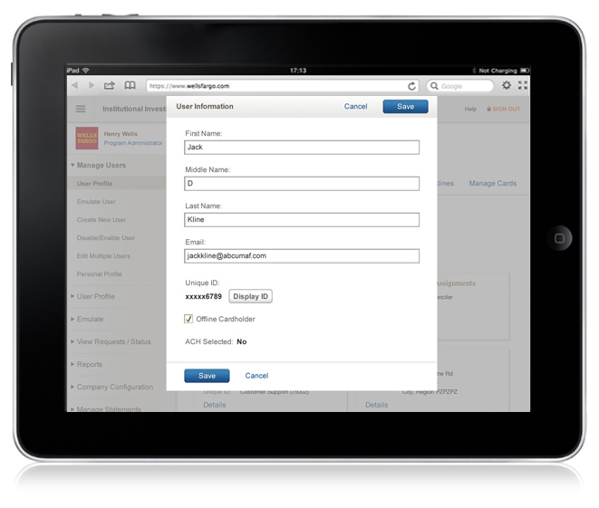
- The Edit a User Profile sequence and visual design variants we tested. See the Responsive Design Prototype in action. (The UI responds to device type and orientation – done years before RWD tools like InVision or Pixate).
UX research and Visual Design ran in parallel tracks, aligning in late 2012 to release Wells Fargos first responsive design UI.
The first release supported desktop and device specific break points for the following devices and respective screen resolutions:
• Desktop (768-1280)
• iPad 2 & 3
• Kindle Fire (Android System Version 2.3)
• Samsung Galaxy Tab 7″ (Android 4.0.4)
• Samsung Galaxy Tab 10″ (Android Version 3.1)
Senior Designer
UI, Interaction, & Visual Design


