For our customers, the most memorable experiences are at times of need.
The post-purchase experience was a huge opportunity for us to promote trust and loyalty in the eBay marketplace, and align more closely with ecommerce retail standards.


For our customers, the most memorable experiences are at times of need.
The post-purchase experience was a huge opportunity for us to promote trust and loyalty in the eBay marketplace, and align more closely with ecommerce retail standards.
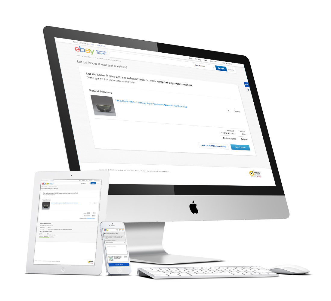
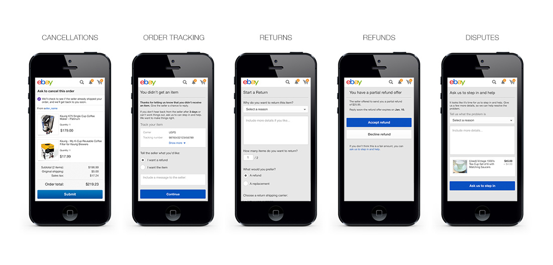
The eBay Trust org launched a large-scale undertaking to dramatically simplify the end-to-end post-purchase experience for both buyers and sellers across desktop and devices. Our goal was to create a holistic UI across web and devices that aligned with current retail-standards and focused on product, policy and service, with emphasis on voice and tone of the customer. The existing experience was far from retail standard and bogged down by confusing eBay policy, a fragmented redundant UI, and inconsistent design. It was a massive effort as each area had been designed and built in silos by different teams, and a mobile experience was nonexistent. Our new streamlined vision allowed seamless transactions across all customer channels, including 5 core areas: Cancellations, Order Tracking, Returns, Refunds, and Disputes. The new product would modernize the architecture into a scalable and intuitive UI, dramatically simplifying the customer-layer across devices.
Working closely with a small team of 2 senior designers, we crafted the experience across desktop, tablet web and mobile web. Initially we partnered with Frog Design to work through the early UX strategy. I came on board after the first round of research had been completed and was tasked with designing the Cancel and Tracking flows, along with areas of the Returns flow. We followed common UX processes by working with eBay users and iterating on feedback and usability studies. After wire-framing my specific flows I led visual design across the project and worked closely with our engineering team to ensure the responsive experience was consistent and met the strict criteria of our emerging design system. The project encompassed over 6 months of research and testing, and after a phased slow-ramp we finally launched all flows after 8 months of design and development.
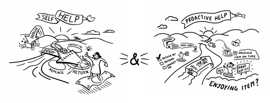
Our UX outcomes focused on 5 key areas:
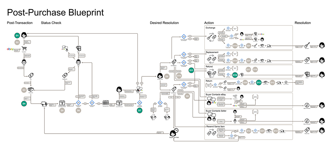
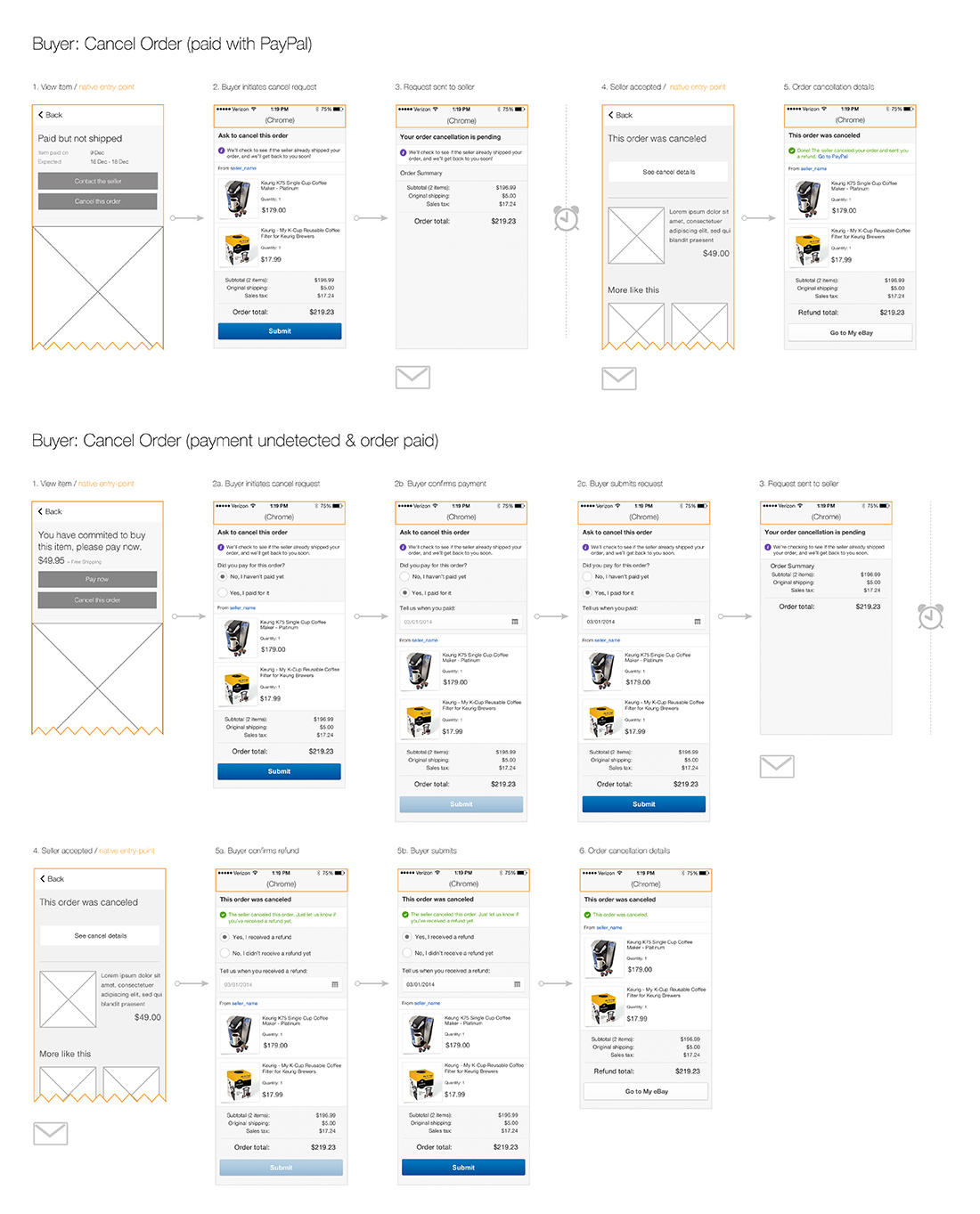
Buyer Cancellation user flow and screen examples of 2 of the Buyer use cases. Policy changes are in effect to reduce friction and support a more retail-standard experience. Email communication was generated each step of the way for both Buyer and Seller. User entry-points were determined by screen size, platform and use case.

The project was a key area of service differentiation. We successfully launched in Fall 2014 with great results; banking an immediate increase in seller NPS along with greatly reduced friction from customer service requests. The new responsive experience is currently available in our top markets – the US, UK, AU and Germany. The final design encompassed over 160 unique screens across core and mobile web with over 100+ use cases.
Below you’ll find some examples of the Buyer side Cancellation and Order Tracking flows (INR or Item Not Received).
Lead Designer – Order Cancellation & Tracking
Visual Design Lead – All Flows
UX, UI, Visual Design, Engineering Support