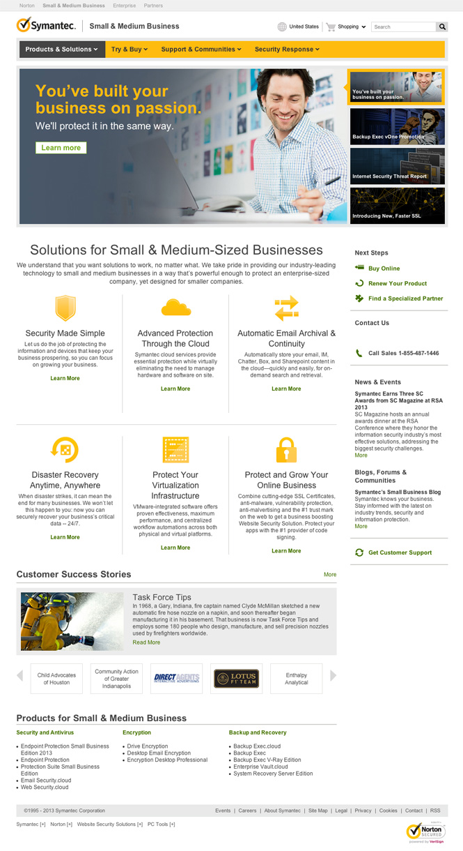
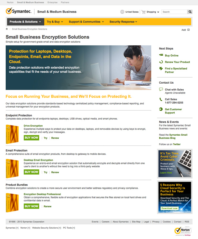
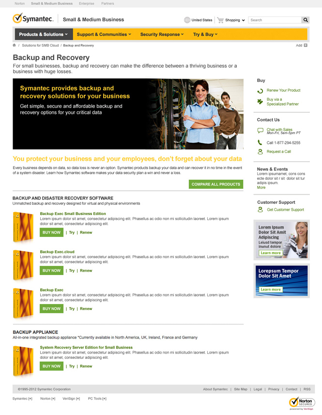
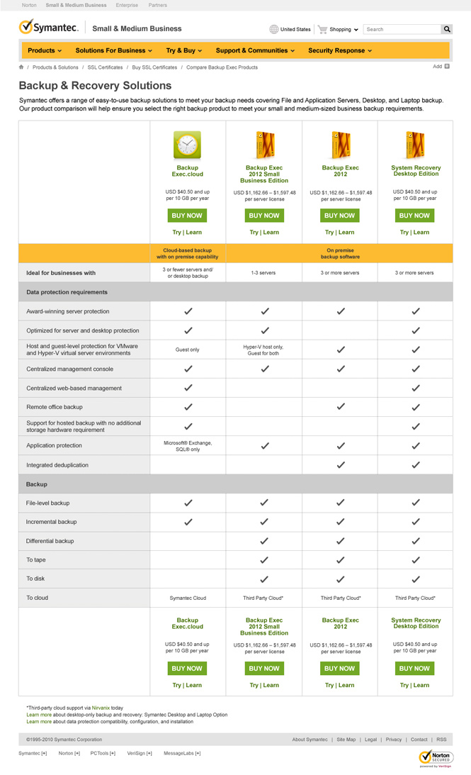
I was hired by the Symantec Small Business team to help define the look and feel of their new global SMB site. Our goal was to create a visually unique site leveraging existing theme elements and the JSP framework of Symantec’s recently redesigned Enterprise site. The current SMB offering was a simple storefront that did not offer the breadth of information and specific detail customers required. Our focus was to emphasize a lighter, more welcoming design, which would clearly express the services and product offerings aimed at small business customers ranging between 5 – 250 employees. My role in the project was to articulate the overarching UI and visual design, create SMB specific components and imagery, and support the dev-team during testing and development. After the US launch I led visual design direction of the regional template roll-out and localization effort, which extended to Europe and Asia Pacific.
The main goals of the SMB site design:
• Position Symantec as the leader in the small business security, backup and file sharing markets.
• Provide a comprehensive destination for small business customers to learn more and purchase Symantec’s offerings.
• Maintain and grow organic traffic to a new Symantec small business destination.
• Reduce the complexity of the current experience and speak the language of small business customers.


